Growth
iSonic has a new look & that’s not all
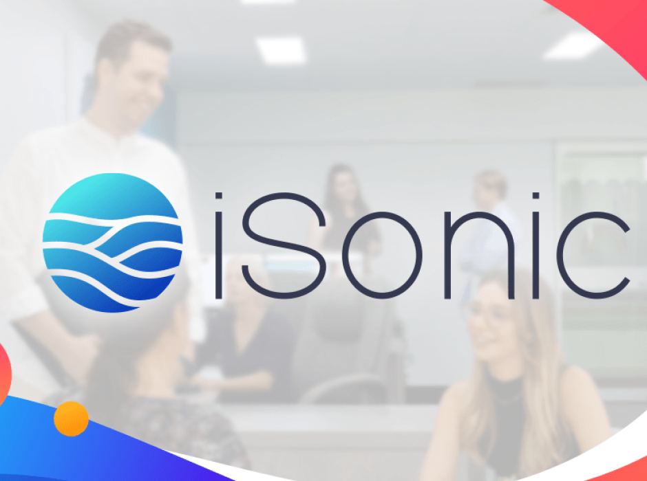

iSonic’s powerful new brand launches today 🚀
Why we got a facelift, and why it matters.
It gets said a lot, but time really does fly in the business world. That’s why it is important to keep your finger on the pulse of the industry you’re in and the broader economy. As the digital world and technologies evolve, businesses that don’t change and adapt to market forces may eventually find themselves left behind or worse – extinct.
The latest iteration of our brand is a testament to our continuing evolution with the digital world. As we change, we want our brand to convey that as an agency we are strong in both the science and the art of digital marketing.
In the beginning …
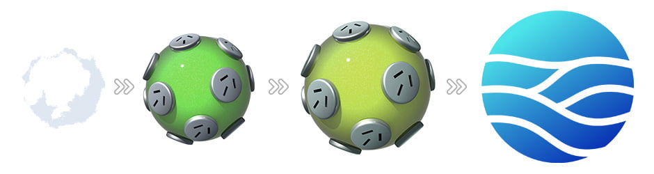
The iSonic logo, we call the Powerball, has been with iSonic since its inception in 2004, just shy of 18 years. Over the last two decades, we have evolved with the latest tech trends in this ever-changing digital landscape we all find ourselves in. We grew from a garage side-hustle to a fully-fledged design and marketing agency working with many of Australia’s leading brands. Whilst our logo font has been updated, the Powerball has always remained the same – until today.
first started trading under the iSonic name.
Into the Digital Age
Reflecting on the last 2 years since COVID-19 reached Australian shores, the economy was thrown into chaos. As a team, we needed to think different, do different – be different. We re-evaluated our service offering and product mix to meet market demand for increased digital services. After undergoing a remix of our team structure and target market, iSonic was reborn as the same business that we always have been – but better.
subdued natural green and yellow styling with a charcoal font.
This move was to modernise the design in line with the “eco” trend of that decade.
A fresh new look
As a team, we decided what better way to celebrate the evolution of our way of doing things, then with a fresh new take on the iSonic brand.
Introducing iSonic in its newest form…
to a fully-fledged digital marketing agency.
We are still the same – but now different.
Here’s the design rationale behind our new look:
- Colour: We say goodbye to the greens and yellows and moved to an electric ocean blue. In the marketing world, blue represents trust and technology – both important to what we deliver on a day-to-day basis.
- Expansion: We have dropped the Aussie power plugs. This represents our target market no longer being constrained within driving distance of our office, but the ability to work with businesses across all of Australia and abroad.
- Dynamism: We have added waves to the iSonic Powerball. This represents where we are located – by the bay, in sunny Cleveland, Brisbane. The waves are also a play on graphs and data representing our shift into data-driven digital marketing services in SEO, paid ads, and conversion optimisation.
- Clean Lines: The font of our logo has changed. The font represents the latest tech that we work with but also being approachable, friendly, and fun, one of our core values.
iSonic’s latest iteration of who we are is encapsulated in our new brand:
“We are still your local digital agency full of fresh ideas and innovative concepts,
but with a newfound focus on solutions that give compounding results to growing businesses.”
Matt Jackson. Founder. 2022.

Get industry insights for your business growth.
Sign up for all the latest updates from our iSonic team including news and industry updates.
Recent Articles